Terabyte
Solutions
Ltd.
Brand Strategy | Visual Identity |
Terabyte Solutions – Powering the Future of Digital Security
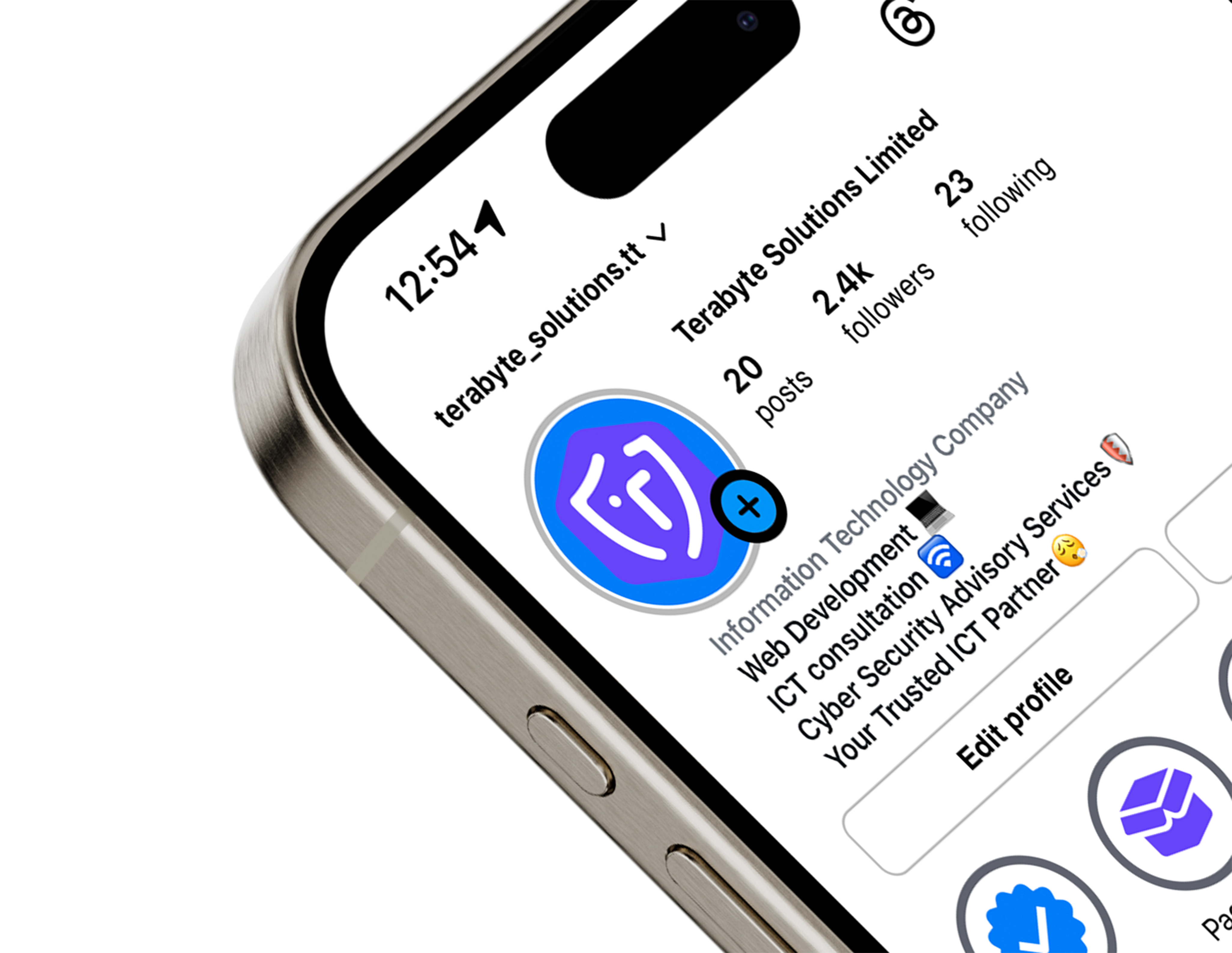
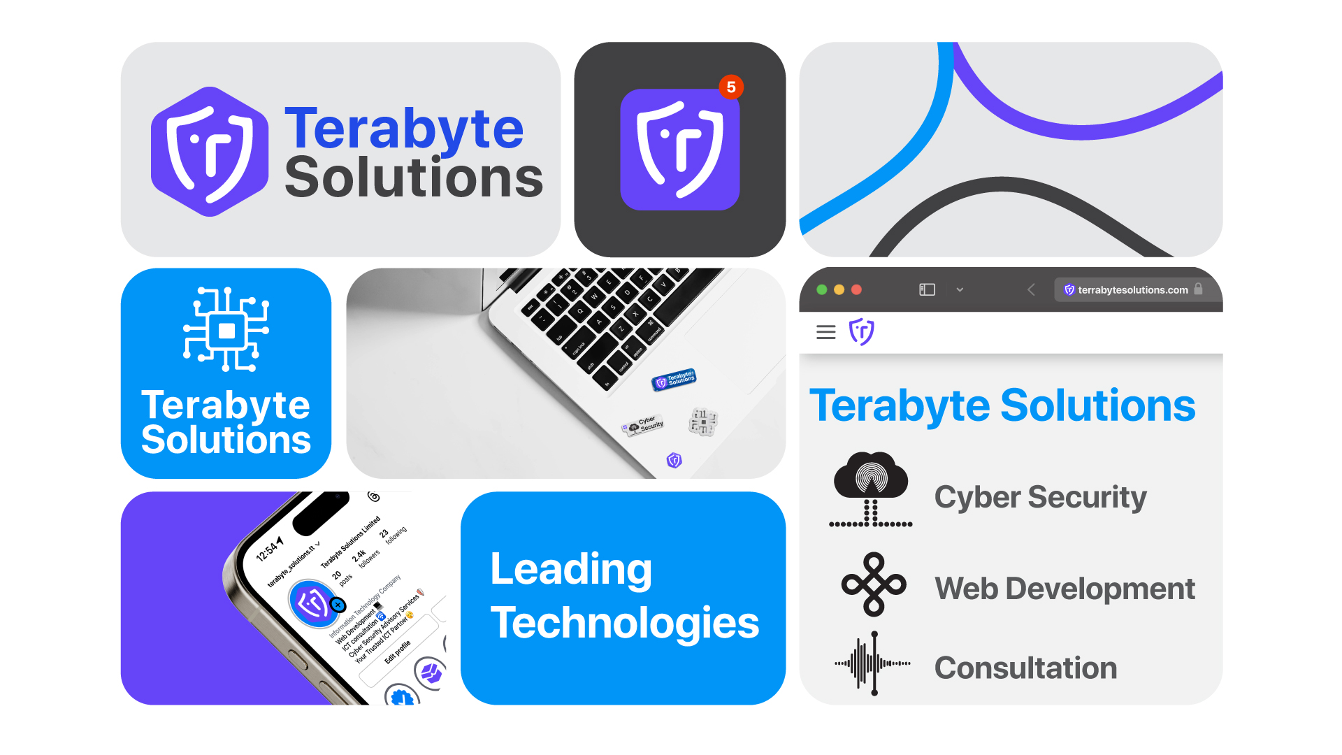
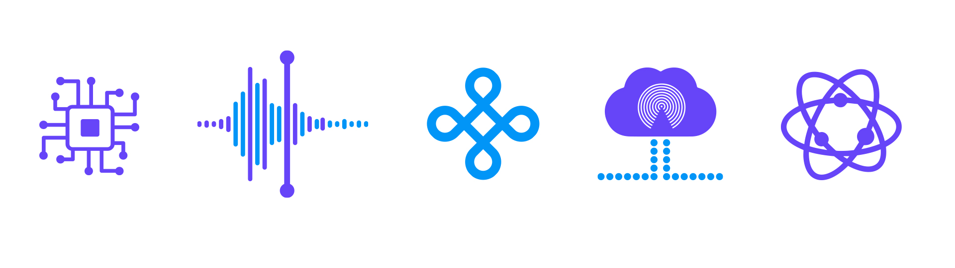
Terabyte Solutions is a cutting-edge tech company that specializes in web development, network infrastructure, and cybersecurity. When they approached me to design their brand identity, the goal was clear: create a visual system that reflects their technical expertise, forward-thinking mindset, and unwavering commitment to digital protection. The identity system I developed combines bold typography, sleek iconography, and a modern color palette that conveys trust, innovation, and professionalism. The logomark is inspired by data flow and secure connectivity a nod to the systems they build and protect. From internal documentation to client-facing touchpoints, every brand asset was crafted to position Terabyte Solutions as a leader in the tech space — smart, secure, and always one step ahead.
Project Goal: To develop a clean, modern brand identity that communicates authority in
cybersecurity and web infrastructure while remaining flexible across digital and print platforms.

Terabyte Solutions secures the web at its core. Clean lines. Coded strength. A brand shaped by precision and powered by trust—built for those who demand performance without compromise.
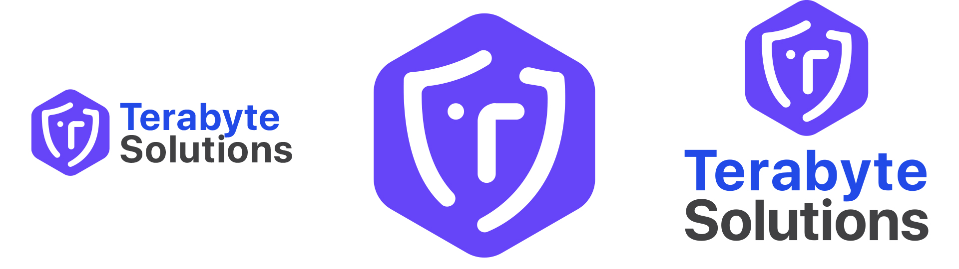
Terabyte Solutions is where innovation meets protection. The sharp geometry of the wordmark reflects precision—an echo of the seamless systems they build and defend. Every angle and line is intentional, evoking structure, speed, and clarity. Hints of electric blue pulse through the identity, symbolizing live networks and active defense. This is more than a tech company; it’s a digital fortress. The mark stands anchored and assured—resilient, strategic, and built for the future.